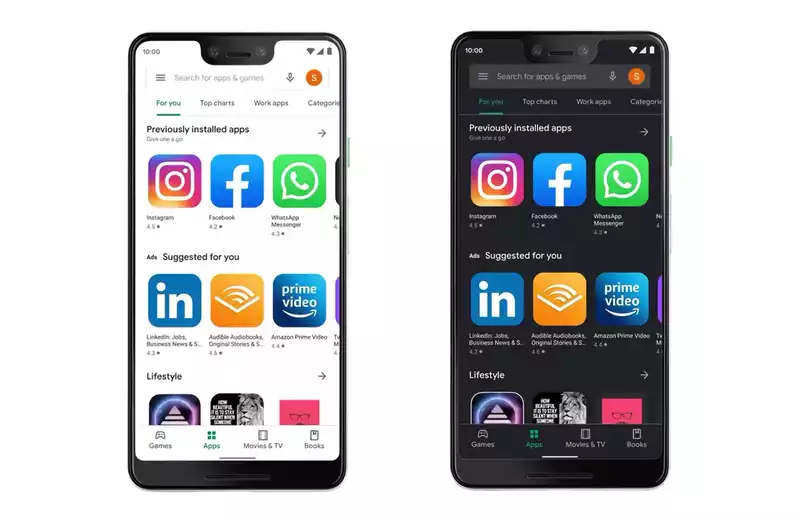
After a long wait, the Dark Theme is finally available in the Google Play Store
Google has been pushing this Dark Theme version on the Google Play Store since the official announcement The update follows the addition of a dark mode to the popular chat app WhatsApp
I had sideloaded the beta package with the Dark Theme from the Google Play Store and had been using the new look for a while But last night, after an automatic update of the Play Store app, I noticed that the entire interface had reverted to the light theme Now it seems everyone should get this version
If you haven't already, go to the Play Store, click the hamburger button in the upper left corner, check for updates and get the new mode
1 Click on the hamburger menu in the upper left corner of the Google Play Store Then select "Settings"
2 Click on "Themes"
3 Finally, select "Dark" if you want the app to always be in dark mode, or "System Default" if you want it to follow the phone's general dark theme settings (which may or may not be present depending on the Android version)
You are now done
The only downside to this dark mode is that it does not use 100% black like WhatsApp The best dark mode apps use something called AMOLED black, and on OLED panels, all black pixels are turned off completely, saving valuable battery life
Many apps offer AMOLED black by default Some offer it as an option (eg Reddit); the Google Play store, like Google Photos, uses dark gray instead This is very annoying, although it saves some energy Don't worry about energy savings: the AMOLED black looks much cooler to me I wish all apps would allow this, perhaps in a system-wide setting It doesn't change anything for the enterprise, and from a UX perspective it doesn't make a huge difference Right now it seems to be wasting my AMOLED based phone and looks like a washed out LCD black


Comments